
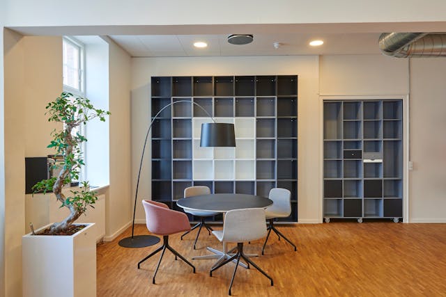
Colors are more than just decorative elements — they play a crucial role in shaping moods, energy, and atmosphere in interior spaces. In workplaces, the right color choice can directly impact performance, focus, motivation, and even relationships among employees. That’s why, when renovating or designing an office, selecting the right colors based on psychology, activity type, and design style is one of the most important decisions.
Why Colors Matter in Office Design
Colors can make a space feel larger or smaller, calm or energetic, formal or creative. In office environments, they influence not only the aesthetics but also employees’ emotional and cognitive states. The wrong choice can lead to fatigue, boredom, or even headaches, while the right palette can boost productivity and make the workplace more pleasant.
The Psychology of Colors in Office Spaces
Blue – Focus and Calmness
Creates trust, concentration, and relaxation. Ideal for finance, consulting, or IT offices to reduce stress and enhance accuracy.
Green – Balance, Freshness, and Well-being
Associated with nature, balance, and renewal. Helps reduce eye strain, stress, and promotes a soothing atmosphere — especially when combined with natural plants.
Gray – Formal, Modern, and Professional
A versatile neutral that creates a polished look. Overuse may feel dull, but paired with warm tones it brings both professionalism and warmth.
Yellow – Creativity and Energy
Symbolizes optimism and innovation. Great for creative departments like design or advertising, though best used sparingly to avoid visual fatigue.
Red – Power and Dynamism
A bold, stimulating color that increases energy and heart rate. Works well in accents (furniture, décor) rather than full walls in formal offices.
White – Purity, Brightness, and Simplicity
Makes spaces look larger and brighter. Works best when balanced with warm or dark accents for depth.
Choosing the Right Color Palette for Offices
- Match the activity type: Analytical tasks benefit from cool, calming tones, while creative teamwork thrives with warmer, energizing colors.
- Align with brand identity: Incorporate brand colors (from the logo or visual identity) into the design to reinforce consistency.
- Consider size and lighting: Light colors expand small or dim offices, while larger spaces can handle deeper or darker tones.
- Combine colors smartly: Use one main color, a complementary tone, and one or two accent shades. Example: Blue + White + Yellow, or Gray + Green + Natural Wood.
Practical Tips for Applying Colors
- Use darker tones for flooring or key furniture for durability.
- Paint workstations with calming hues to enhance focus.
- Reception or meeting areas can handle bolder, more engaging colors.
- Introduce color through accessories (artwork, rugs, plants, curtains) without repainting.
- Coordinate with lighting to ensure true color effects.
Conclusion
Colors are a powerful tool in office interior design. When chosen wisely, they can transform the workspace, boosting productivity, motivation, and reinforcing brand identity. The right color strategy should consider the type of work, brand image, spatial dimensions, and overall design style.
FAQ
Is blue suitable for all office spaces?
Not always — while great for focus, it should be paired with warmer tones in creative environments.
Which colors enhance creativity and motivation?
Yellow and orange, when used in moderation, stimulate creativity and energy.
Can dark colors work in small offices?
Yes, but only in accents and balanced with light tones to avoid a cramped feeling.
How can colors align with a company’s brand?
By integrating brand hues into walls, furniture, or décor for a cohesive visual identity.
Do colors affect stress levels?
Absolutely — shades like green and blue can lower stress and promote calmness.
How to match colors with design styles?
- Modern/minimalist → neutral and light tones
- Industrial → earthy and dark shades
- Classic → warm and formal colors


